
Stroll Health
Stroll Health aims to promote value based healthcare for everyone. Their mission is to become the future of easy, affordable healthcare.

The Challenge
Given the data driving KPIs that Stroll currently collects, build a dashboard that physicians and organization administrators can use to make their processes more efficient.
Team
Eight awesome, multifaceted designers worked on this team.
My Role
I wrote and conducted user interviews and contextual research; explored user experience design and data visualization; produced visual design assets and assembled our final prototype.
Our Solution
Our dashboard assets are Material Design inspired cards with accordion style expansions to reveal more insightful data.

Fortunately, healthcare professionals keep themselves busy providing healthcare. Unfortunately for us, that made them hard to find time with for interviews and usability tests. We catered IDEO's Design Thinking process to our needs, iterating and validating simultaneously.
Research
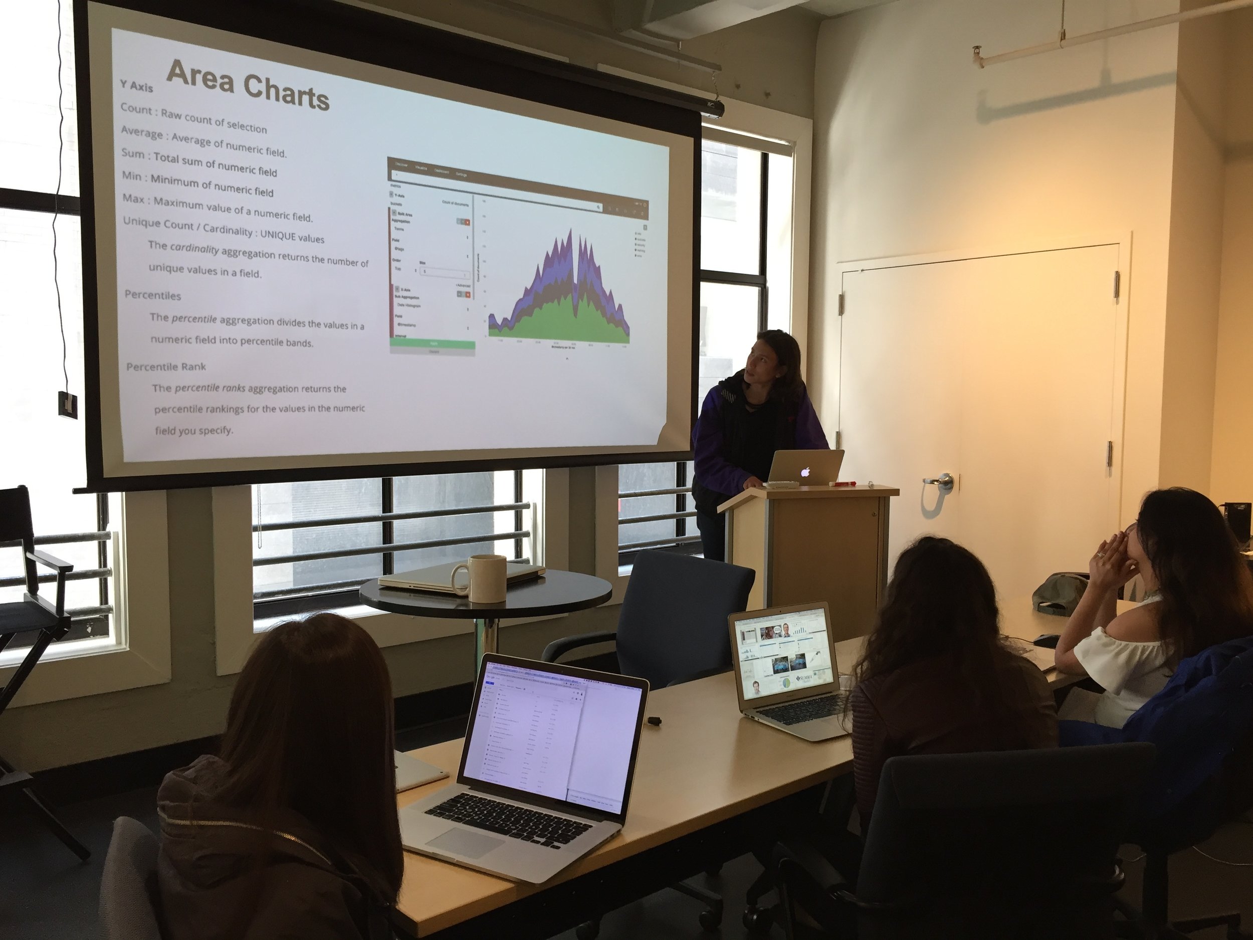
We took a look at Stroll’s competitors and got a feel for the market. Then we took a deep dive into the world of Kibana and Elasticsearch – tools used by Stroll Health to collect and manipulate data.

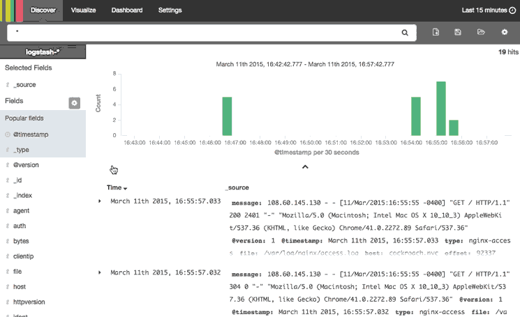
We weren't expecting to become proficient in the software, though our designs would need to conform its capabilities. Our client provided a sample data set we could use to think about how they interact and the best visual ways to present the data using Kibana.

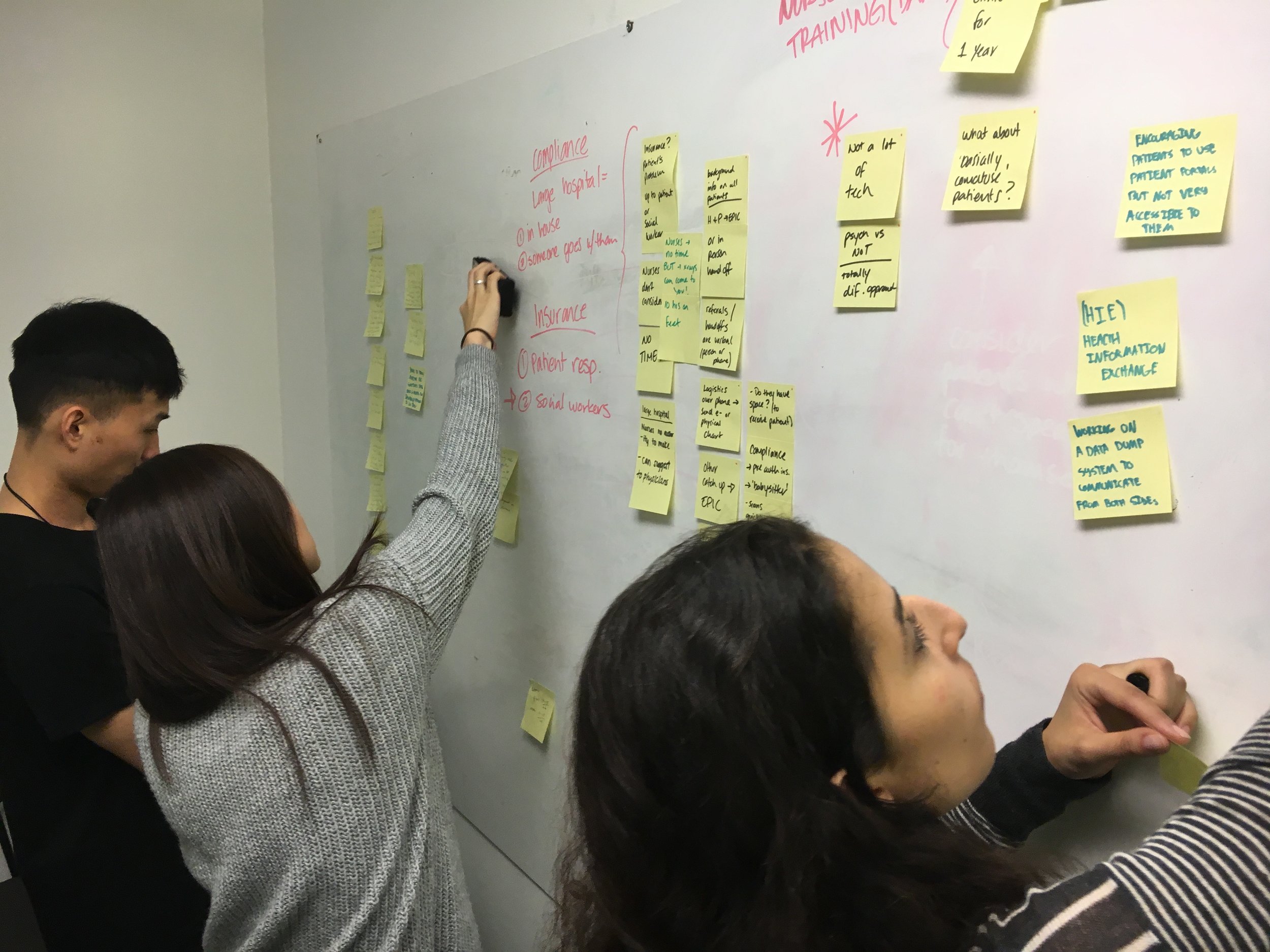
Now that we understood our tools, we needed to get acquainted with our users. We had a long list of healthcare professionals that would be using this dashboard ranging from nurse practitioners to hospital administrators; specifically anyone involved in the referral process.
The referral process is the cycle that patients go through when their physician requests an x-ray, for example. The doctor or their administrator will monitor whether the patient schedules and takes the test, how long this takes, where the patient goes for labs and if/when they receive the results. Our dashboard will assist in monitoring this cycle for all patients and enable users to provide better quality healthcare.
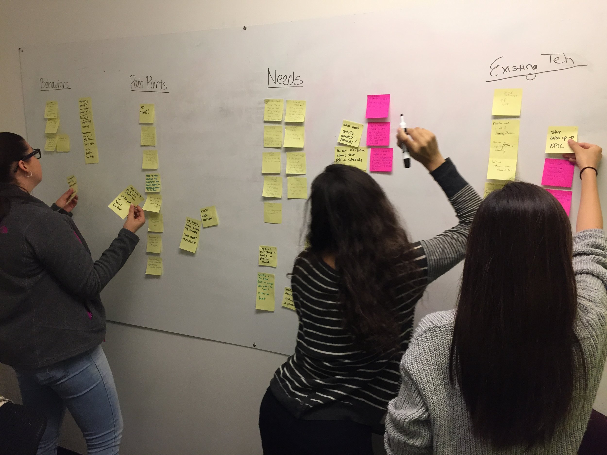
We researched the specific job functions of each target user and structured our interview questions to discover their needs and day-to-day life. We tailored our questions to find out which KPIs are most important for them to have at a glance - if they had a dashboard to glance at, what would they want to see first?
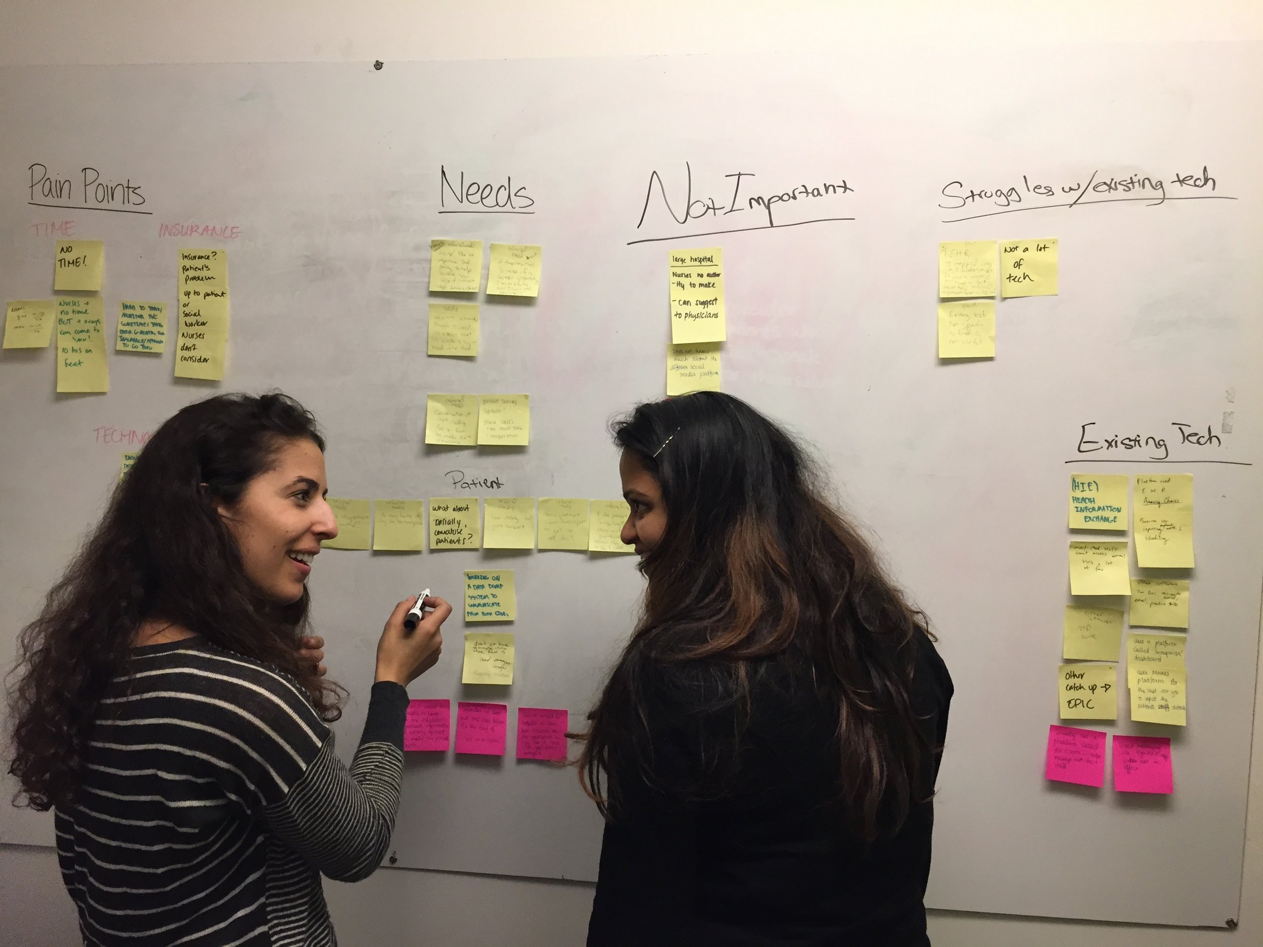
At this point we decided to step back and take another look at the project scope. In order to produce a succinct design in the time allotted we would need to narrow our focus.
We defined our two major target users and prioritized the KPIs most important to each.


This exercise helped us frame our information architecture, and the problem to solve moving forward: How might we highlight specific metrics users need most at the top of the dashboard without making them dig into graphs to understand the data?
Ideation
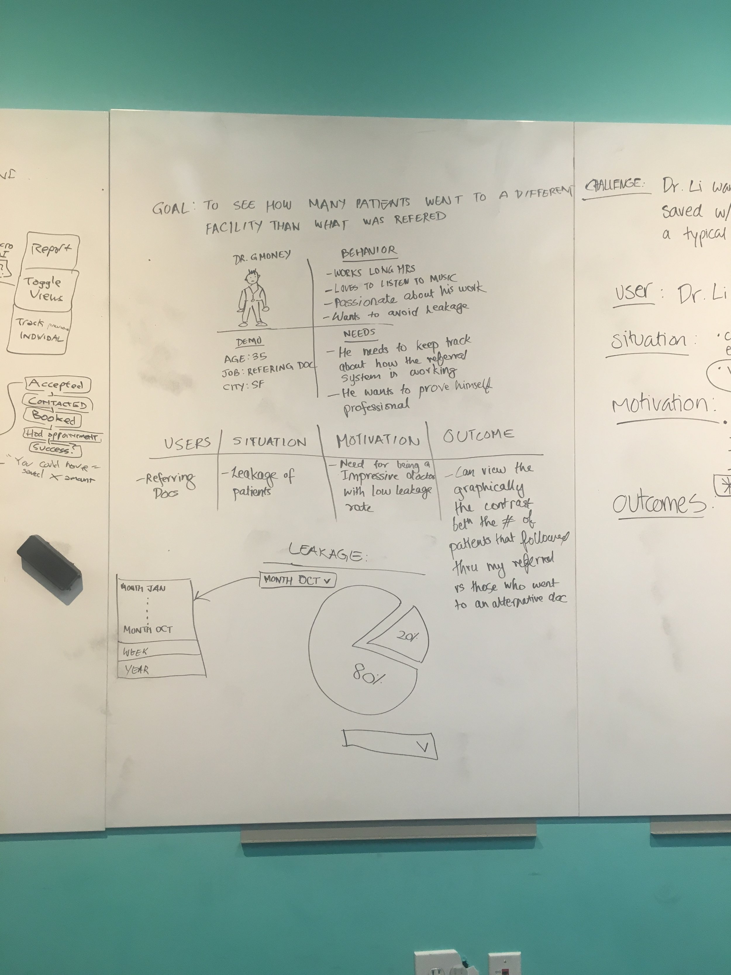
We talked through user job stories to start building the user interface. Stories like: Let’s say Dr. Li wants to see how much money her patient Seth saved with her referral relative to the amount of a typical order.
We paired up and took a scenario where a certain user would need to check a certain KPI and had twenty minutes to sketch a solution. We mapped out our user's journey identifying motivations and desired outcomes, then quickly sketched different ways to visualize the metrics. Each pair presented their ideas to the rest and we decided on the best.


Low fidelity
We presented our work in bits and pieces as we were able to find time with different healthcare professionals. They were very gracious with their time ad feedback, and were excited about the solutions we were working on.

Each time we met with a user, we had a newer, clickable lo-fi prototype for them to test. Each time we asked ourselves: How well will these visualizations fit together within the constraints of our screen? What questions will we need to ask users when we test next?
In addition to relying on the knowledge of healthcare professionals, we leaned on our peers for design critique. Dashboards are complex, we needed fresh eyes to make sure our ideas combined made sense.
At this point we were ready to start bringing our wireframes to life. We would continue to nip and tuck along the way based on feedback from our user interviews and critique from our peers. Some minor changes at this point were to separate the cards from the top navigation, rearrange some of our charts and move from a modal popup to an expandable view. While we iterated, we got to play with color and iconography.
High fidelity
As we considered pumping life into our grayscale canvas we kept Stroll’s design principles in mind:
- Be Inviting: Make each touchpoint feel friendly and human through carefully considered style elements.
- Be Clear: Communicate information clearly and offer straightforward navigation.
- Empower Users: Instill confidence in the data provided by Stroll so users can make the best choices for themselves.
- Prioritize Efficiency: Make the user's journey through the site quick and effortless; reduce and reuse elements whenever possible.
- Think Modern: Offer clean, inviting aesthetics that convey professionalism and build trust.
As we considered color and iconography, we refined interactions based on user feedback:
- We made each card expand, instead of using modals, so users don't feel like they need to leave the dashboard to get more detail
- We improved the usability of the search bar by separating the filters
- We made sure cards were presented in the order of importance considered by the users
Takeaways
Like all things in life, trying to make everyone happy at once is impossible. Our dashboard gives users:
- an at-a-glance view of their most important metrics
- customization capabilities
- the ability to click in and get detailed information each metric without leaving the dashboard
Wrap up
We learned a ton about the intricacies of data visualization, being able to provide many levers for multiple types of users to pull while keeping the design clean and simple.
It took a lot of diverging and converging on ideas, and extra hard work from our project leads.