
First Derm
First Derm is an app that enables users to quickly and anonymously consult a dermatologist for minor skin conditions. The product bridges the gap between "mhm, what's this?" and "I need to see a doctor ASAP".
The Challenge
Rebuild their current Android and iOS apps from the ground up. Get to know the users, identify pain points and design improvements as needed using the lean methodology.
The Team
Twelve awesome, multifaceted designers worked on this team. We broke into research, Android and iOS teams.
My Role
I was on the research and Android teams. We each took a section of the app to drill down into and practiced pair design with our iOS counterparts.
Our Solution
We dedicated the first two weeks to research, taking a deep dive into First Derm’s market and user context. Android and iOS teams used the research to redesign the apps.

Research
First Derm was built well by doctors and engineers, but the product was ready for the designer’s eye. We make sure the design combines what the user wants (better usability) with our client’s needs: higher conversion rates and more opt-ins for higher-tiered pricing.
Think about designing for trust and credibility, and convincing people to pay for something. We challenged ourselves with some questions:
- Where does First Derm fit in with someone’s treatment? What are the long-term effects?
- How might we present the process as less transactional?
- How do we make treatment more efficient across the board?
- How can we make an app sticky in telehealth, especially dermatology? Understanding the needs of telehealth users – Can we supplement real face-time visits?

Which, of course, brought up more questions:
- Do users who pay more have a more severe condition? Do they pay more because they meet a certain income level?
- Are there any trends between payment selected and dermatologist recommendations? Ex: more over-the-counter prescriptions recommendations
- Are there any additional correlations between payment selected and gender?
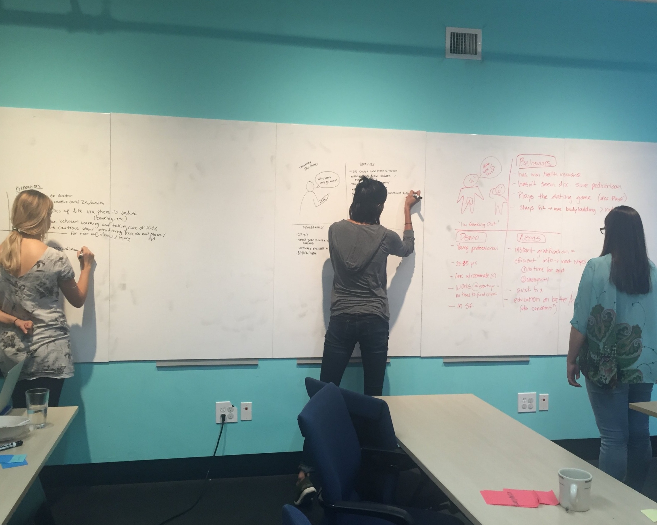
In order to find the right users to talk to we needed to create them first. And, in order to provide a quality design within the scope of the project, we needed to create constraints – things we can test:
- People value time and are willing to digitally replace face-time with their doctors
- Users don’t need to see who their doctor is to trust the app’s recommendations
- Those with STDs want to maintain anonymity
- Users rely on First Derm as an alternative for urgent cases that don’t require the ER
- People trust the diagnostic means (photo/digital) and believe the guidance is legitimate
Meet Christina and Sam, our young mother and twenty-something professional. Let’s meet some people like them and see if our assumptions are right.


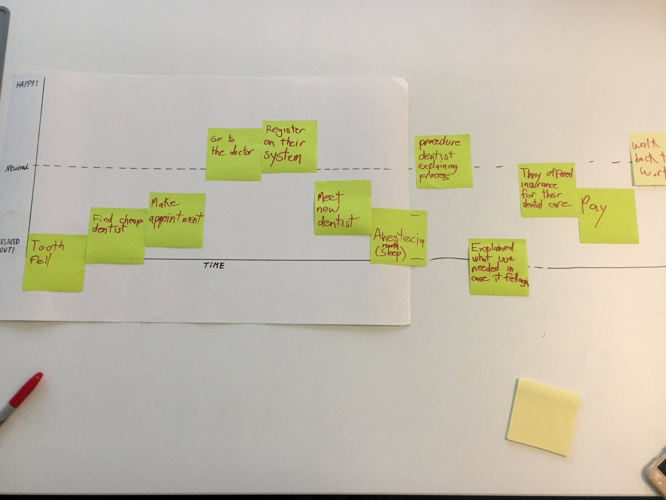
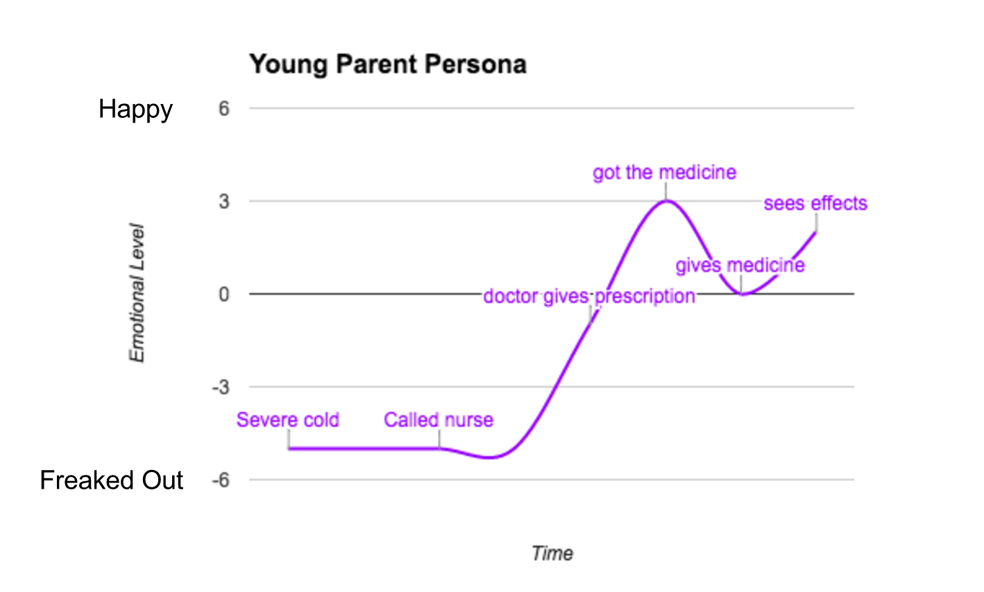
The Happiness Roadmap
Part one of our interview was called "The Happiness Roadmap". It helped us gain an in-depth understanding of how people treat their health, how they seek information, and how they make decisions.
We wanted to see where First Derm fits in in the journey toward treatment. See the difference between a Christina and a Sam below:

What makes them freak out the most?
Younger, millennial males tended to be most concerned about the price of healthcare. Parents are more concerned with the outcome of their children’s health. The lowest point for both was when they felt like they had no control over the outcome.
What makes them feel better?
Most felt relaxed when they were heading to the doctor or when obtaining a prescription. When they felt in control.

What important insights have we gained?
Millennials use apps to find doctors before booking appointments; they look for good reviews and good ratings. People were not hesitant to share medical info digitally, but they were interested in knowing information about the doctors answering questions.
Moms crave as much insight as possible on their child’s pediatrician. Aim to make medical experiences less transactional and build trust.
Usability Testing
Part two was a usability test of the current product. After interviewing five iOS and six Android users we gathered a ton of feedback on the usability and comprehension of the app. In particular we identified pain points in Android users with different hardware. Most importantly we found our designs did not need to stray far from one operating system to the other.

Our findings gave us three key objectives:
- Keep users better informed: incorporate a "How it works" section to establish credibility by letting users know what to expect
- Emphasize user anonymity: provide clear and transparent information on how the identities of patients and doctors are protected to make users feel comfortable
- Improve usability: redesign how some features are presented to make it easier for users to flow through the app
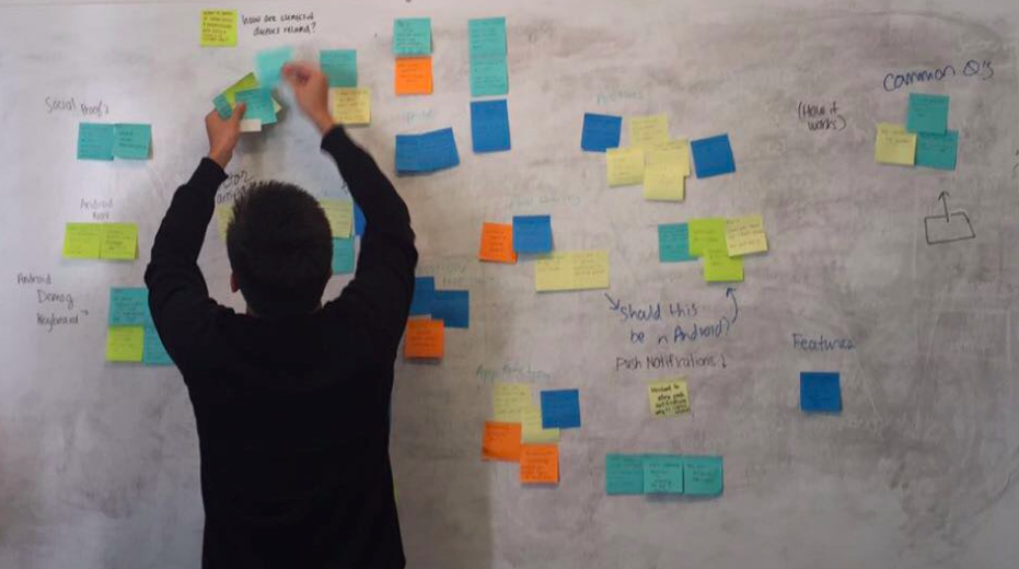
Ideation
The Android and iOS teams were ready to hit the ground running armed with our user insights and competitive analysis. There were some ideas from the market we thought were worth exploring:
- Credibility - provide more information on both doctors and on medical conditions
- Anonymity - chat room for patients to chat with their doctors
- Usability - an onboarding page that provides an overview of the process before jumping into the camera
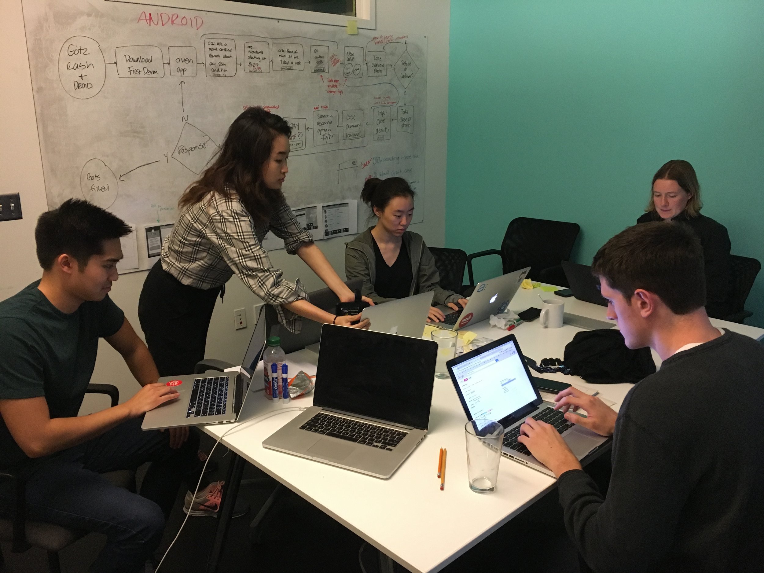
To kick-off, both Android and iOS teams outlined our task flow and intended adjustments.
My job was to tackle the "More" section on Android and bring information and features that were otherwise undiscoverable to light. I paired up with my iOS counterpart and we set out to hand sketch UI ideas for our sections.
We made some decisions here based on our objectives and consensus on sketches:
- clean up: condense the information on input and payment screen
- differentiate: New Cases and Draft screens
- more info: take two photos for the information page
- usability: choose a bottom tab for “Home,” “New Case,” and “More” information as opposed for hamburger menu (iOS)
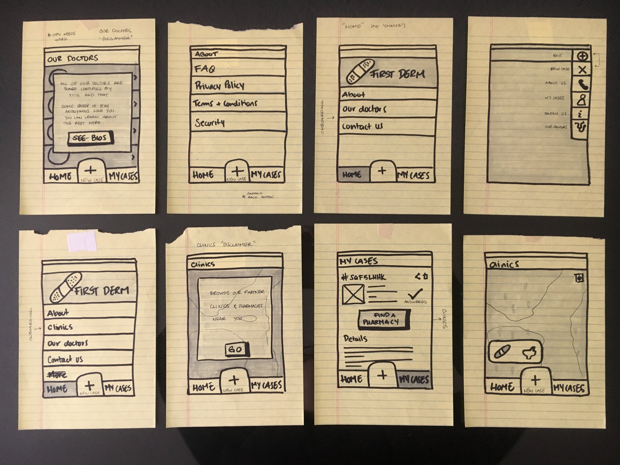
Low fidelity
Our main objective was to build trust with our users so we needed to ensure information about the service would be easy to find. When considering a healthcare product, users expect things like the Privacy Policy to be front and center. We had to decide on the best way to make the More section obvious without distracting from the New Case feature. I tinkered with a few ideas for the main navigation using Sketch.
As we did with our hand sketches, we gathered for sharing and critique. Each team member brought several good ideas for each feature we were focused on. We integrated each other's ideas into our own designs and built a lo-fi prototype using Sketch and Marvel:
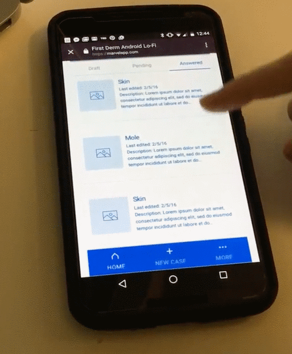
We tested a new five iOS and five Android users on the usability and comprehension of our lo-fi prototype. While we were steering in the right direction, our new group of users gave us a nice new list of pain points to solve. Each team member shared their interview results and together we categorized and prioritized our findings.


We met with our client to present our findings and ask questions that came up during our synthesis, then got to work making changes.
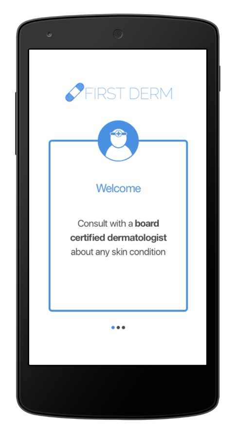
High fidelity
First Derm provided their style guide for us to work with, and with new interaction also came color.
I took inspiration from cards in our lo-fi and applied it to other areas like the Our Doctors section to give them a different feel. Users craved more information about the dermatologists answering their questions behind the scenes. First Derm protects the anonymity of doctors and patients alike. My task was to showcase the doctor profiles in a way that builds trust, so I chose to show them as a handful of featured doctors as cards.

Once again we shared our ideas with the team and converged on the best designs to apply across the board. Then we rounded up another few users to test our hi-fi prototype on.
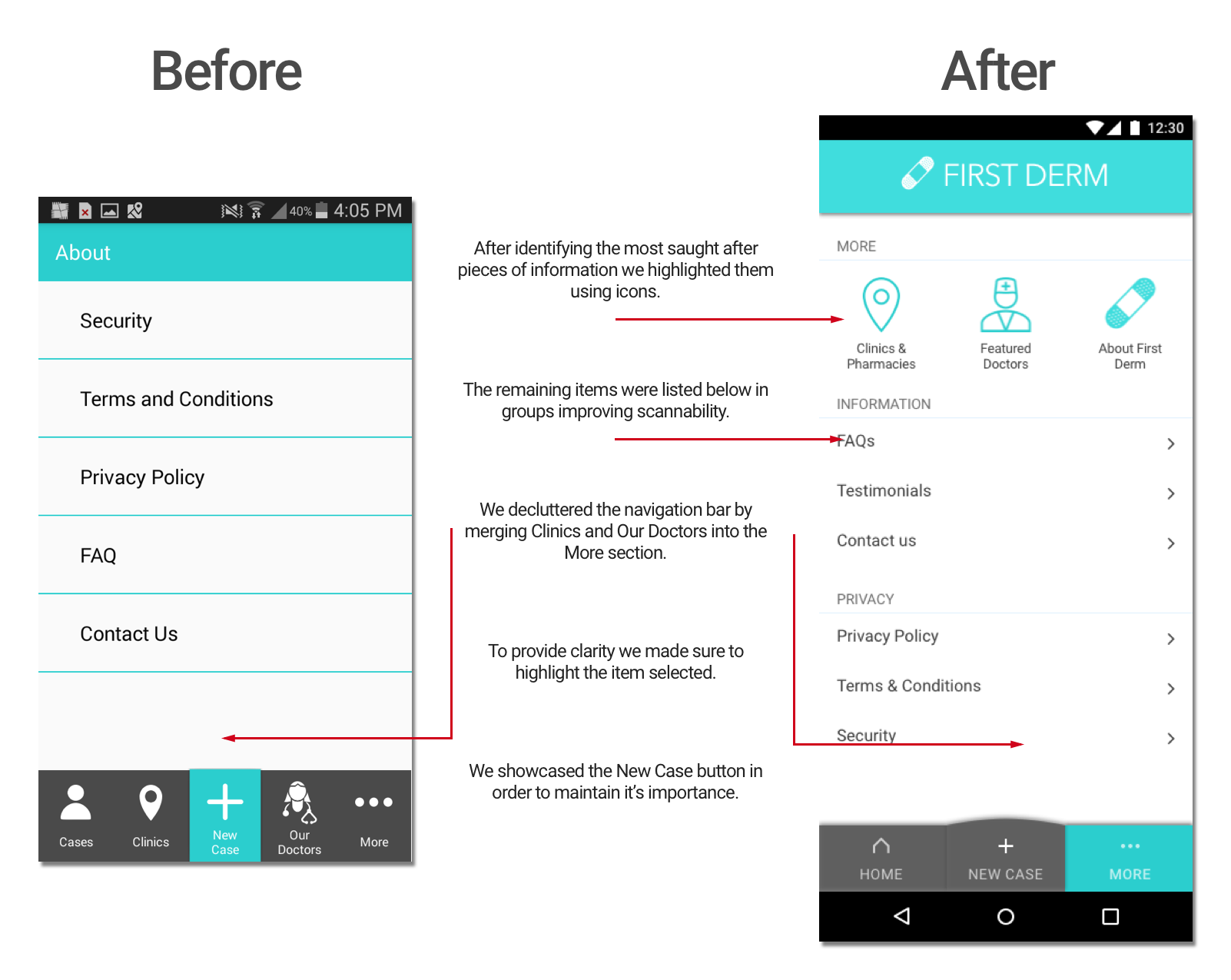
We took their feedback to make any last minute changes, and presented our final prototype. Here are the major design changes made to the More section:
Among the users we tested during these six weeks we noted a pronounced difference in their understanding of the product. While our first round of testing showed some confusion about functionality, users who tested our final prototype were much more comfortable and confident.

Takeaways
Among the users we tested during these six weeks we noted a pronounced difference in their understanding of the product. While our first round of testing showed some confusion about functionality, users who tested our final prototype were much more comfortable and confident.
Wrap up
Our team had a final feedback session to digest the ups and downs of the project and provide constructive feedback. Our client was very pleased with our work and we all celebrated together.