AVA
AVA is a hardware and software ecosystem built to optimize fitness. Our client came to use with technology and an idea to run with.
The Challenge
Our client required high fidelity designs to show potential investors and to use as a baseline for branding. To produce these designs we identified the target user, built the information architecture and chose the operating system.
The Team
Seven awesome, multifaceted designers worked on this team.

My Role
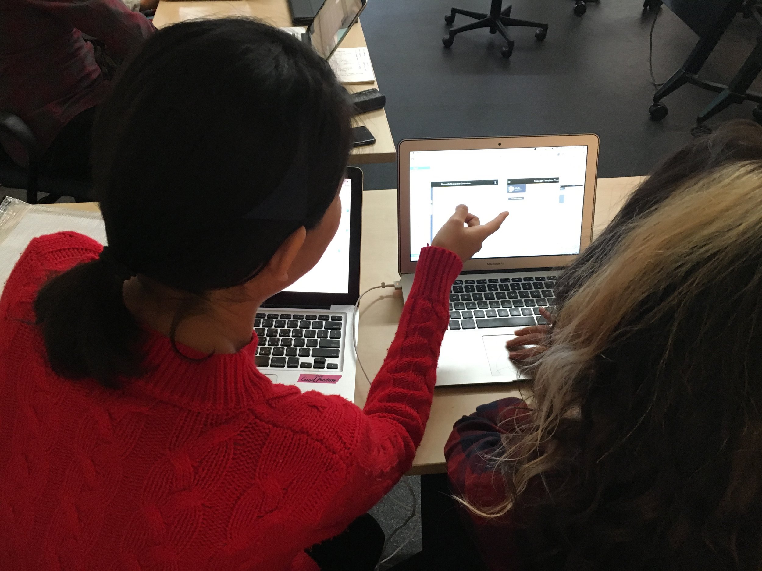
As the project lead I both herded cats and communicated with our client. I participated in each stage of the design process by interviewing users, sketching, wireframing, creating mockups and prototyping.
Our Solution
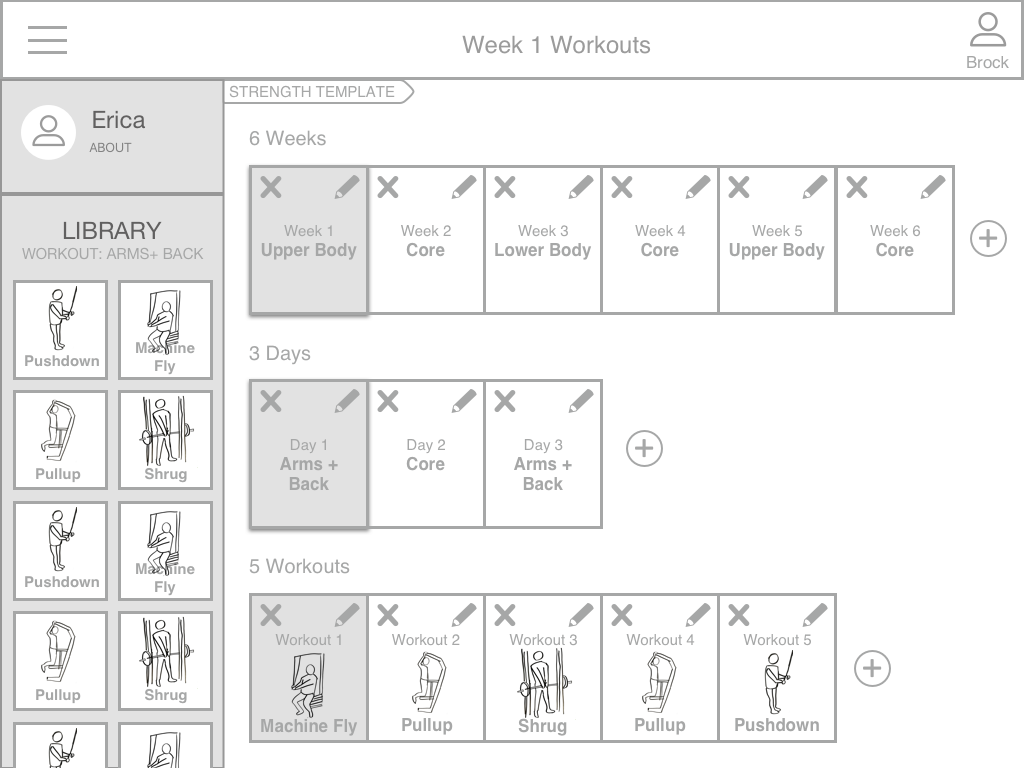
We designed a high fidelity prototype for iOS iPad for a one-on-one personal trainer experience.

AVA was a great rollercoaster. Combining our collective [lack of] technical knowledge of the personal training world with the intricacies of the AVA software and, for most, you'd get a recipe for disaster. Our team did an excellent job in acting on informed assumptions and delivering high quality mockups.
Research
We had a blank canvas to work with, which means we had to gather information on the market and potential users first.

Now we were better equipped to state and solve our problem. Take the infinite software capabilities to manipulate virtually every variable in a workout and put that power in the hands of personal trainers.
Meet Brock and Erica. Brock is a personal trainer and Erica is his new client. All of our design decisions will be based on helping Brock develop a personalized workout plan for Erica.
Ideation
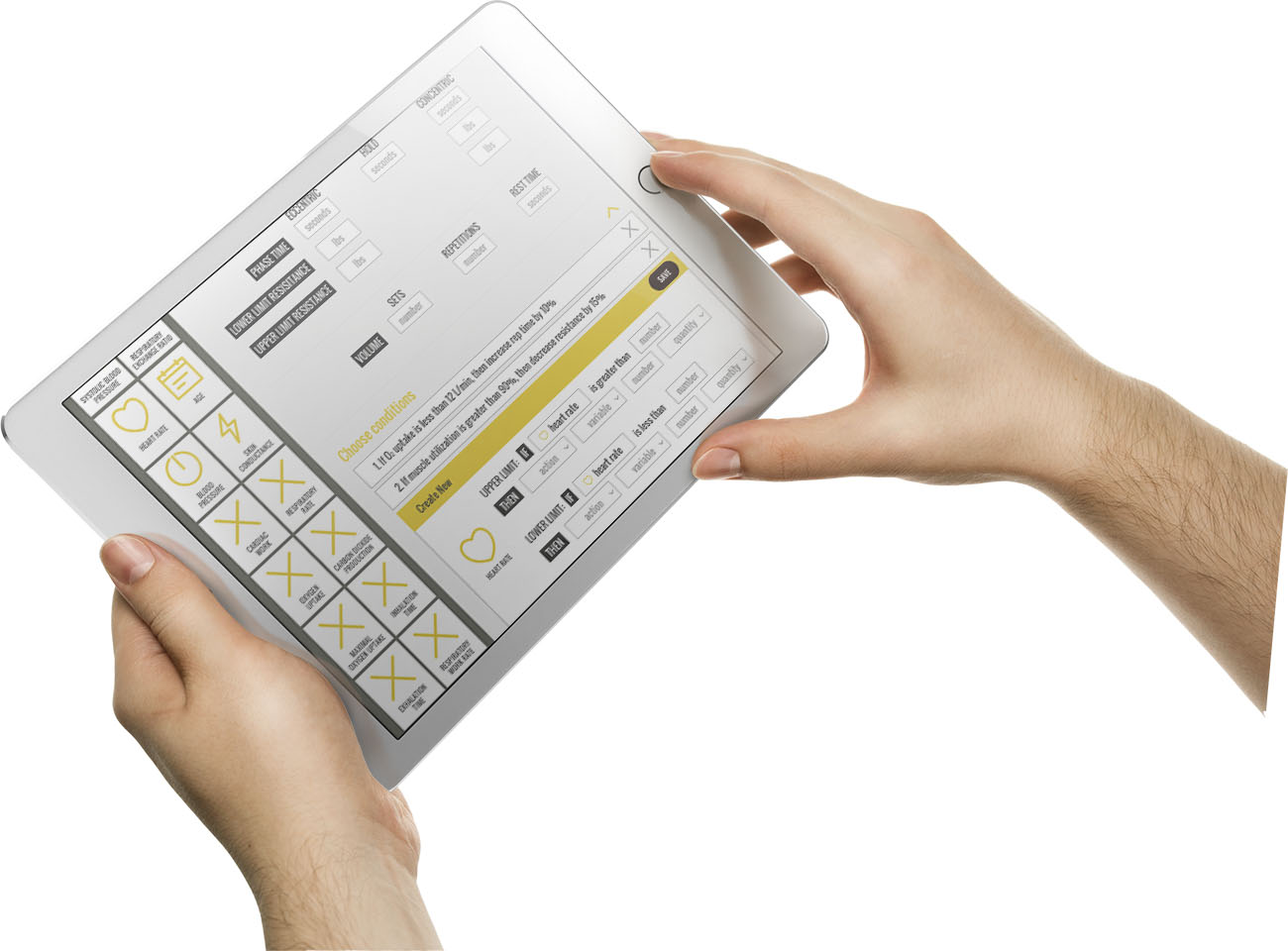
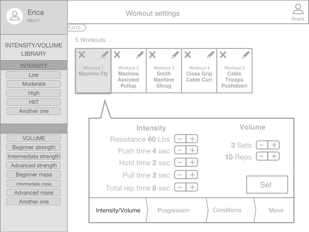
AVA lets you control the variables on every movement of a workout. While developing his training plan for Erica, Brock uses AVA to manipulate the resistance and weight applied to each movement.
Pumped yet puzzled, we set out to sketch ideas on what AVA might look like. Taking advantage of our team size we decided to diverge and converge. We sketched ideas individually – using software like Apple iMove, Google Analytics, Adobe CC and video games for inspiration – and as a team voted on the best options.


After a couple rounds of ideation we were ready to start building our low fidelity prototype.
Low fidelity
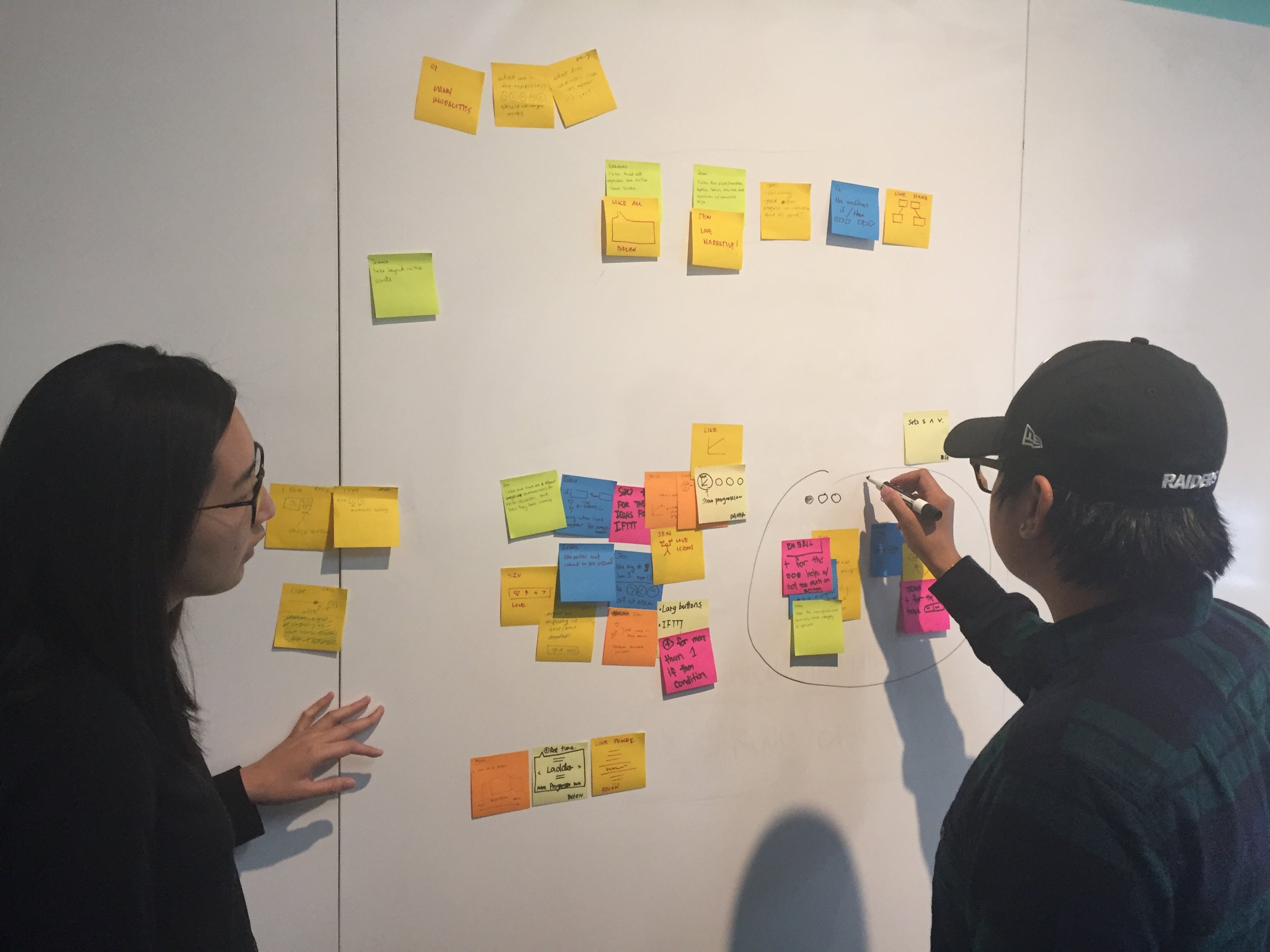
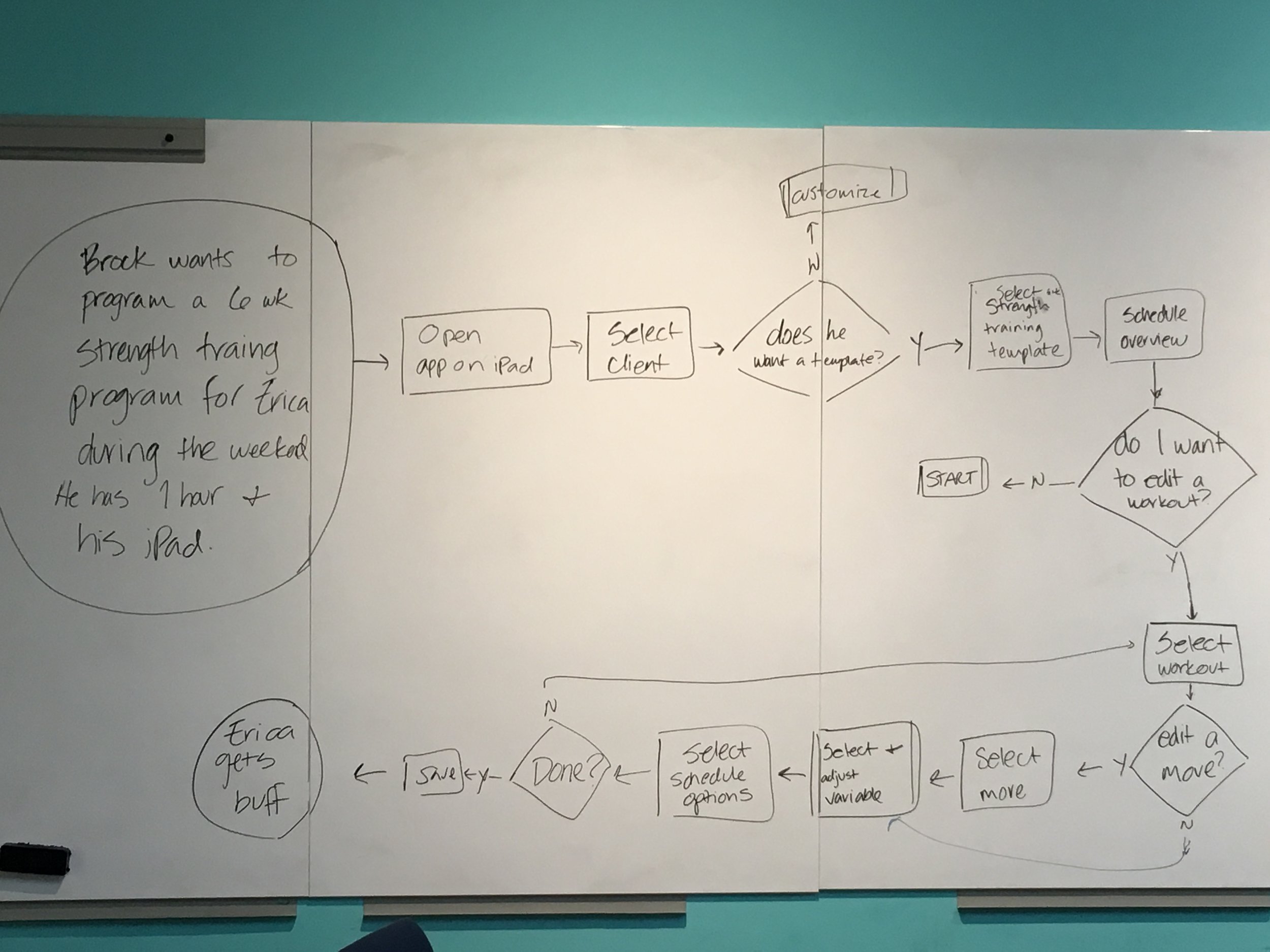
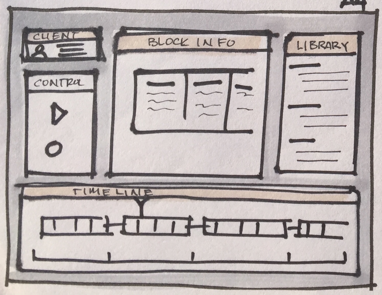
Before we even think about pixels, we mapped out our information architecture on a whiteboard.
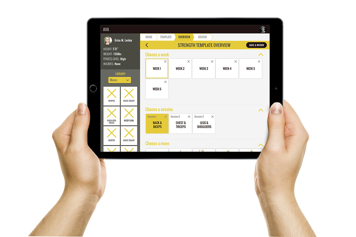
We wanted to give Brock the ability to drill into the details of each movement, as well as zoom out and view the entirety of Erica’s workout plan.

Next we mapped out the flow. To design this well we needed to create some constraints. We decided to focus on how Brock might go about creating a workout plan for Erica.

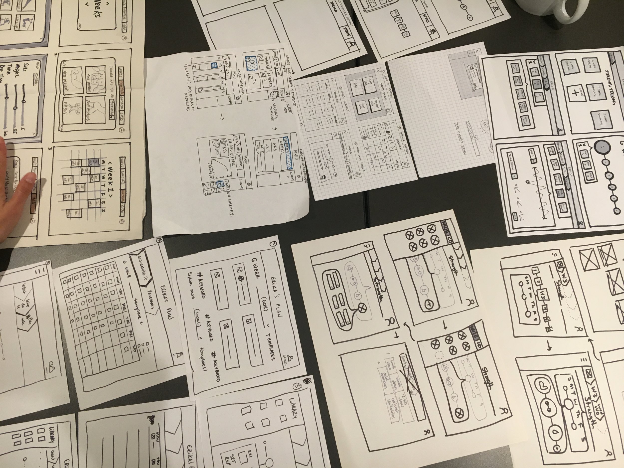
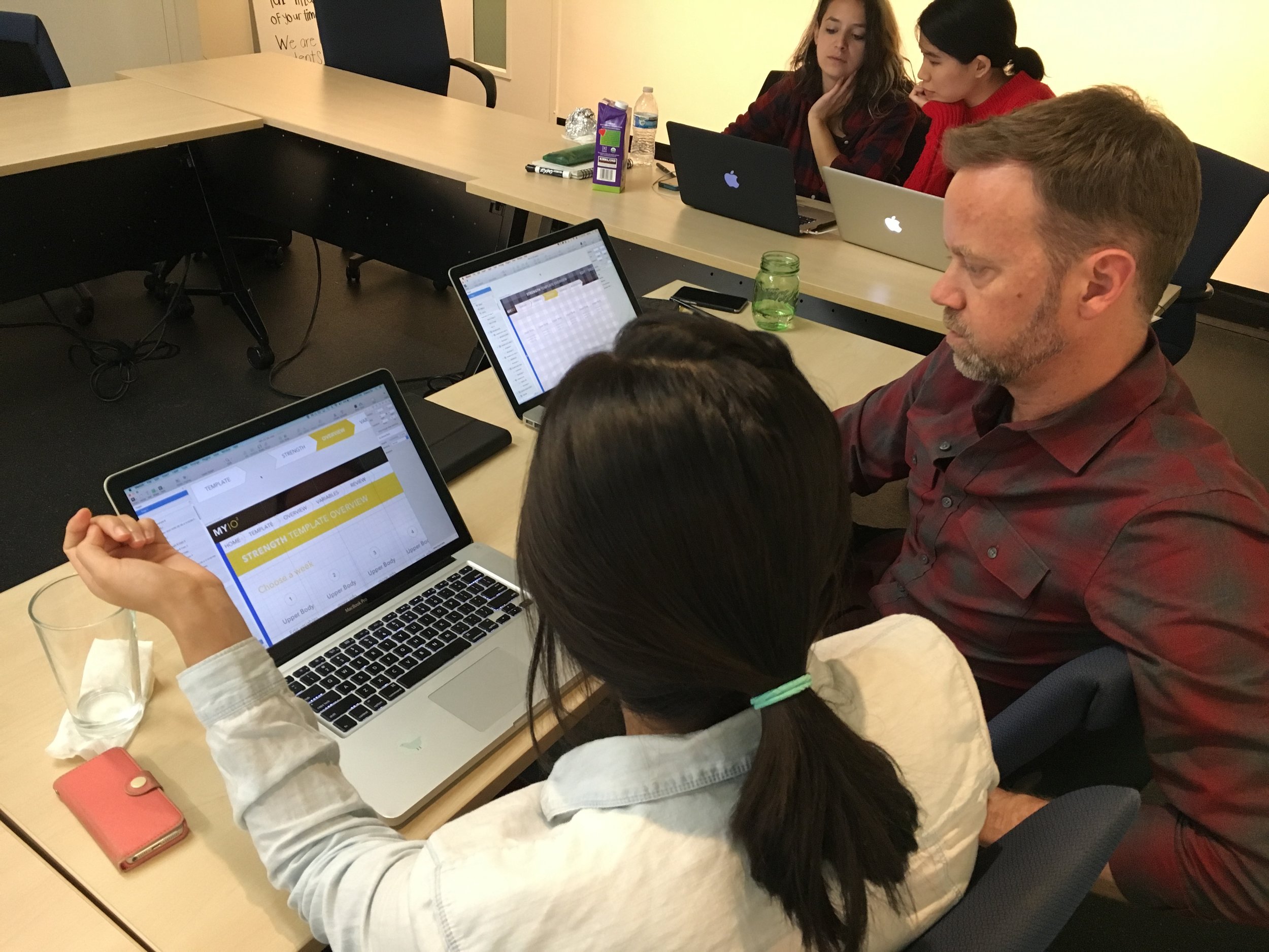
Next step is to put some bones on that meat. We began creating digital wireframes using Sketch to represent certain key screens in our flow. Again, we diverged and converged to come up with many ideas and pick the best of the bunch.
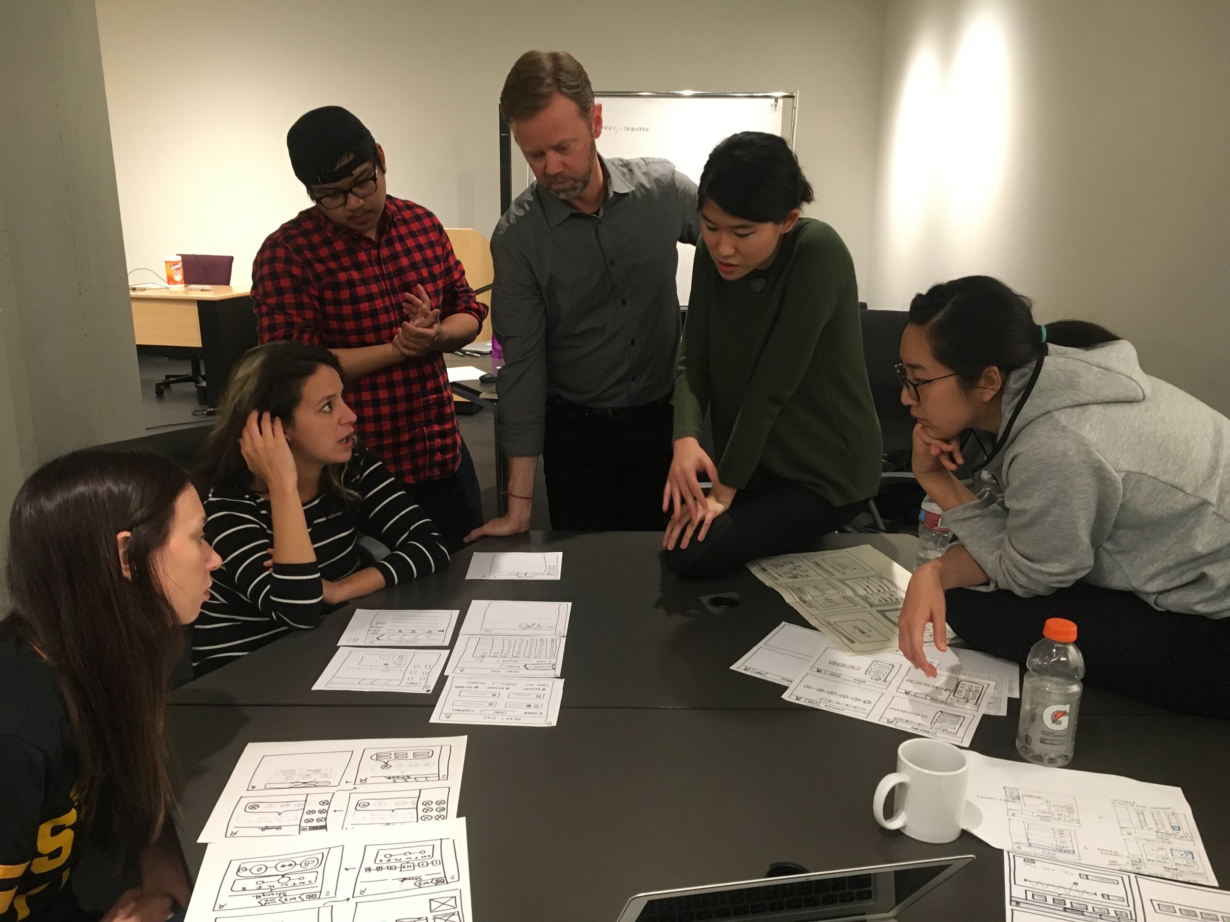
If there was one notable hiccup in our process it was here. Too much of a good thing – ideas – can do that. As a team we endlessly debated the ideal way to present our flow - how might we make this complex system as simple as possible to use?
As head cat herder, I made sure to structure our meetings in time-boxes, giving us time to consider options while continuing to make progress. I was a constant reminder to consider our chosen users and flow, and leave outside considerations for another day.
It was time to ask some real “Brocks” what they thought about our assumptions so we could start working out the kinks in our design.

The Brocks helped us understand how trainers approach programming today, and whether AVA might address their needs.
Lo-fi Contextual Takeaways
- the length of program matters less than muscle group
- employ awareness of the science behind moves
- they appreciated the library to access moves
- we confirmed mostly personal trainers in large gyms would use this
Lo-fi Usability Testing Takeaways
This feedback helped us transition into the bells and whistles of the hi-fi stage with a clear flow in mind. We took advice like "make it more personal" and insights on workout program lengths to tie together our design.
High fidelity
Next it was time to think type, color, and the best ways to address pain points found during our interviews. I had team members pair up to tinker with different ideas on how to bring our wireframes to life and set the tone for AVA’s brand.
Design Decisions
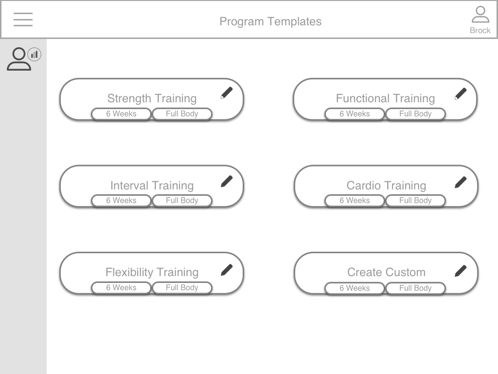
- Designing for 1:1 training: After interviewing group trainers, we noticed that the need for this kind of software + machine wasn't attractive for group trainings, where the trainers "eye" it's enough. Instead, AVA looks very attractive for high performance clients that use more intensive trainings and demand a more accurate follow up throughout their process.
- Stick with vertical scroll on iPad: The horizontal timeline for editing variables was more difficult to scan, and started getting confusing when interacting with other types of scroll. For version one, we stuck with simplicity. We designed for a progressive vertical scroll with a static header and library.
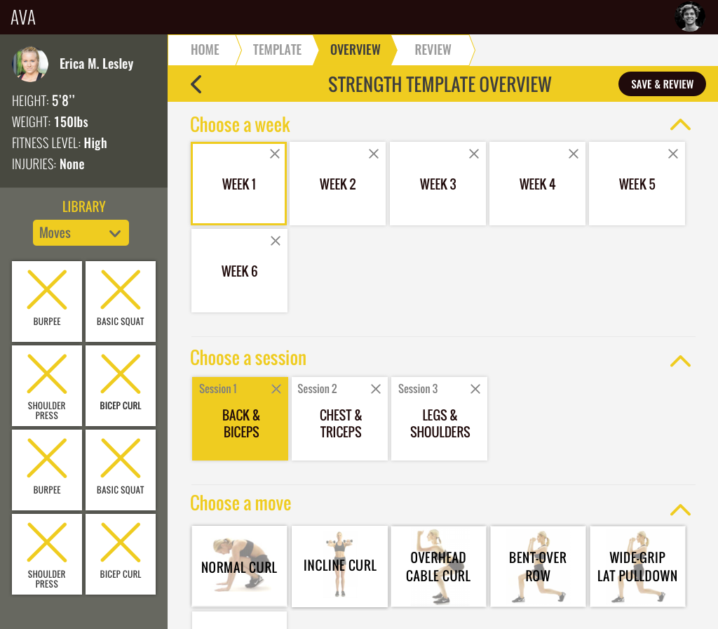
- Color palette: We tested different combinations of blue and yellow hues that resulted in too strong colors to coexist. We decided to keep only one color and eliminated blues as a color more related to other types of apps (like banking for example). Yellows felt more consistent with AVA's brand attributes.
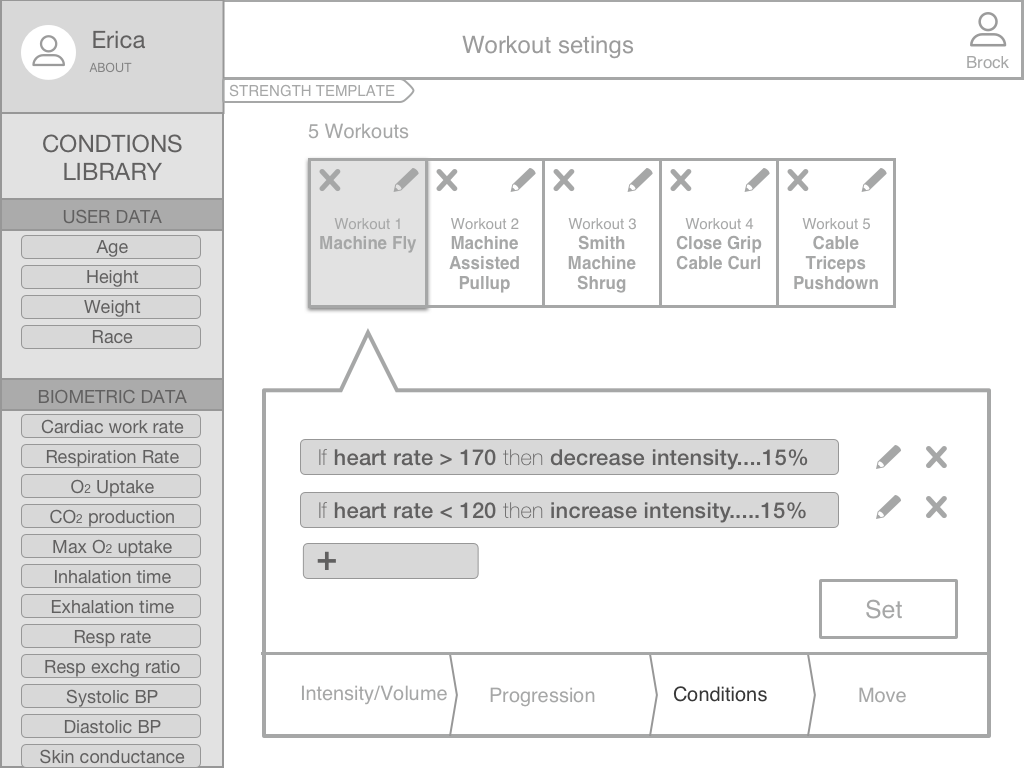
- Default conditions based on client information: One of the main problems we had organizing the IA of the app was to group the conditions in a way that users can intuitively adjust. We ultimately decided to assume some of the conditions are preloaded into the client information. This decision helped our design remain intuitive at a glance and complex at it's core.
- When in doubt, go with a form: Again, we went for simplicity. After testing different ways of editing the conditions, we noticed that the form with contextual text was the most clear and accessible for different type of users.
Armed with our knowledge and style guide we divided up our screens and got to work putting together our high fidelity prototype.
We decided to test our prototype on fellow designers who are familiar with iOS, but not with AVA. We asked them to be Brock and build a strength training program for Erica.
Hi-fi Usability Testing Takeaways
We found that though the users we tested had no knowledge of the world of personal training they thought our design was straightforward and were able to use and describe the product accurately.
Takeaways
The AVA team was pleased with our design and they provided great constructive feedback. We recommended steps for their next phase:
- Test the hi-fi prototype with personal trainers
- Create assets, eg. icons and photos of moves using AVA
- Define universal conditions for templates
- Design for other app features, eg. Create a template; and other app screens: Client profile, Home, and Review
Our team met for one last time to assign a last round of design adjustments (including the dreaded organization of Sketch layers), our style guide, and research and recommendation deliverables.
Though some times were tough for our team, we maintained a timely and respectful relationship with our client. In the end we learned a good way to improve our process is to communicate more often than we think is necessary. Clients are more interested in our process than you think, and may even have some knowledge of the tools we use.
Wrap up
A few very important things to tie the project together:
- We took a couple of days to step away from AVA before meeting to talk about final touches.
- We spent most of our final meeting sharing feedback on our team dynamic and lessons learned along the way. This was incredibly helpful for each of us as we were able to voice opinions and concerns when the pressure was off, and we all learned from each others learnings. I felt everyone left that day with a much higher appreciation of the experience.
- And then we celebrated together!