
Blue Barley
The true test of my transition. Take a concept from abstract to prototype on my own, and turn what used to drive me mad about my previous roles into an enjoyably usable product.
Operations managers are often tasked with pretty much anything that comes up. Sometimes that turns them into something they never thought they'd be: event planners. Suddenly, they're spending hours on end researching what a random group of people would consider fun, and playing phone tag with dozens of vendors who refuse to be transparent. All working within the constraints of a budget and manager who will ultimately have the final say.
Enter Blue Barley. After a year of researching the space and throwing spectacular events of the highest quality, it's time to digitize the experience. Enter me.

The Challenge
Though many solutions have been tried, event managers are still using word-of-mouth, Google and an old fashioned spreadsheet to to plan each event. The process arduously boring. The type of thing that makes you think about how your time would be better served doing your laundry. As a first step toward an all-inclusive event planning marketplace, Blue Barley asks:
- How might we create a product that planners can quickly click through and obtain multiple proposals with more accurate pricing to consider?
- How might we get more users to request a quote?
Our Solution
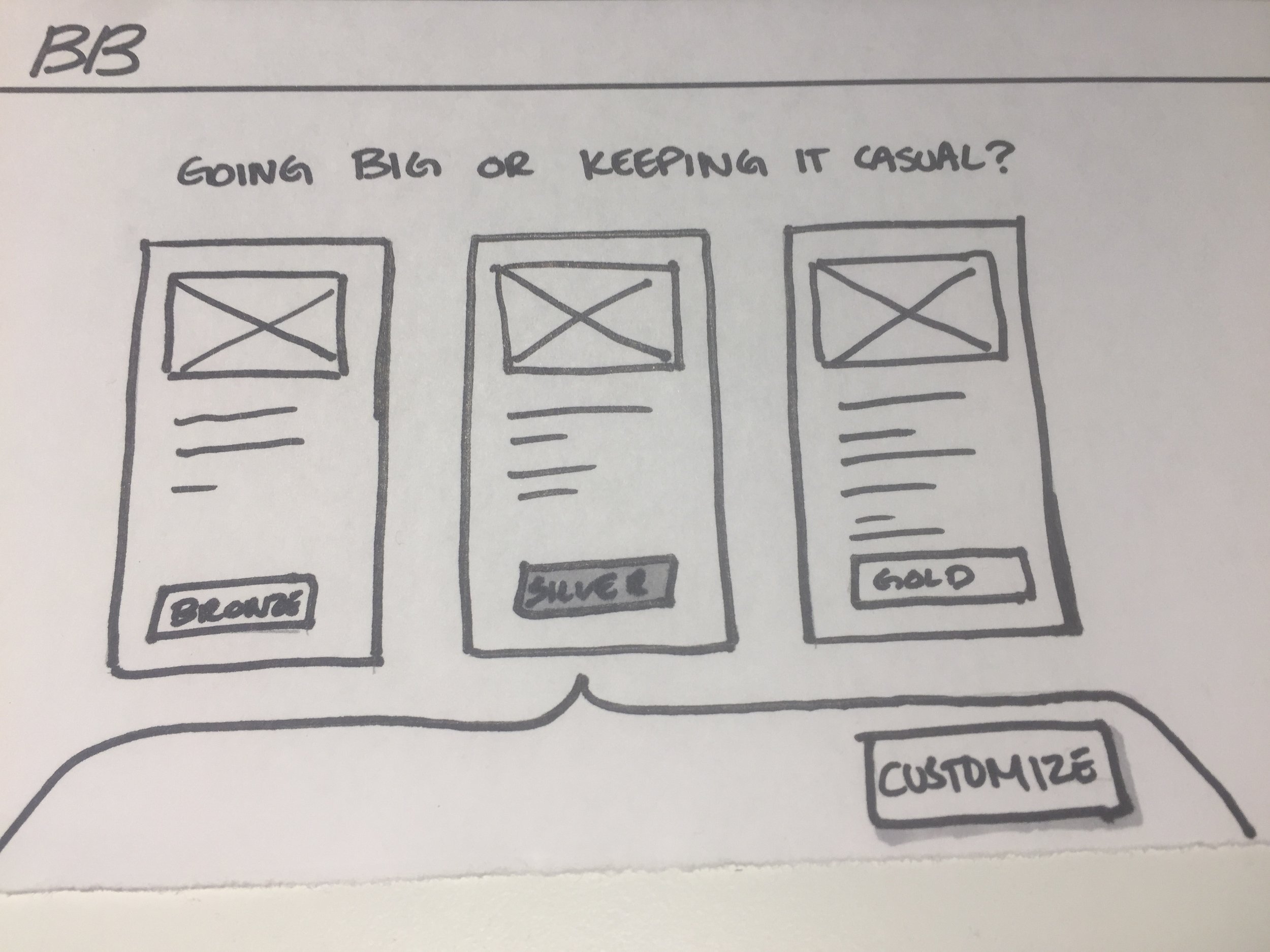
We turned roughly 20 hours of research and phone calls into a fun 10 minute form. I designed for web with a responsive layout.
My Role
I was the sole designer on this project working closely with the client to conduct user interviews, ideate, and consider business goals in design decisions.
My Process
Using the design thinking framework we employed four iteration loops with incrementing levels of fidelity.
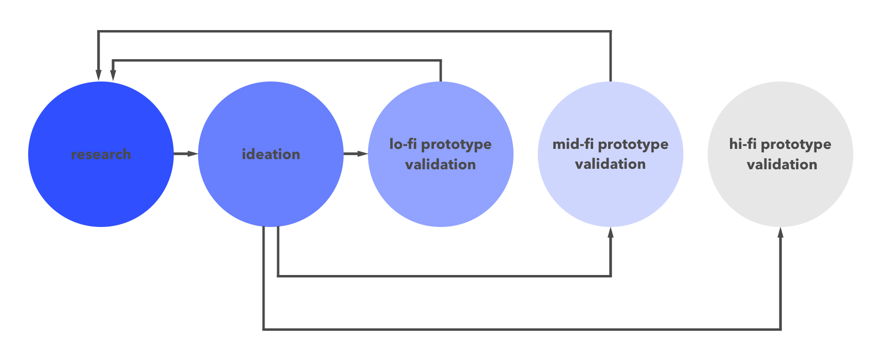
Research
I took research Blue Barley had conducted and their defined user personas. I researched both competitors site as well as sites from multiple different industries for inspiration. I dissected the current user flow and used it to begin to build a better information architecture.


Lo-fi Validation
After putting together the first lo-fi prototype we presented it to several users who provided their feedback. In reviewing our findings we discovered the need to add a second round of validation in between this one and the high fidelity version.


Usability Testing
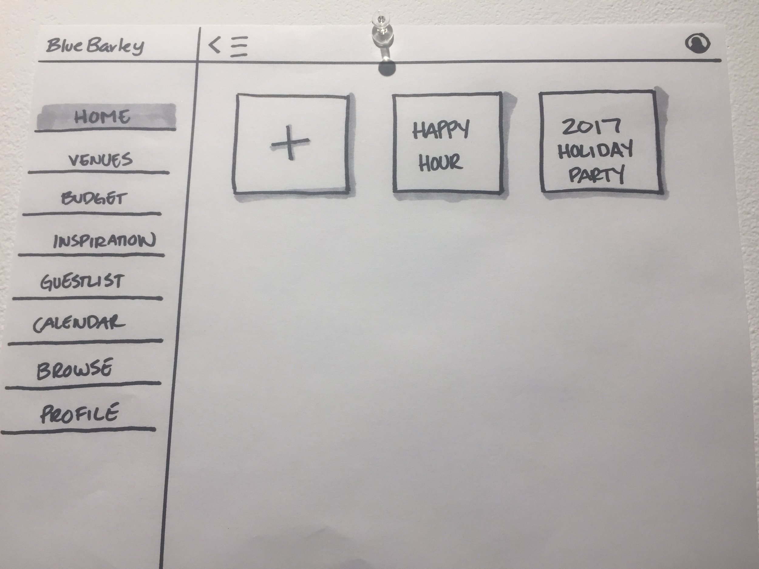
When beginning a project from scratch I like to let the users speak to me. I put together a basic wireframe prototype that represented a proposed new flow.
We interviewed five female, ops/sales professionals who agreed:
- They always start with Google.
- They're happy with their current tools: spreadsheets and docs.
- They want control over when they speak to a human in the planning process.

Soundbites
I wish this was all in one place.
Give me suggestions.
I don't like surprises.
Takeaways
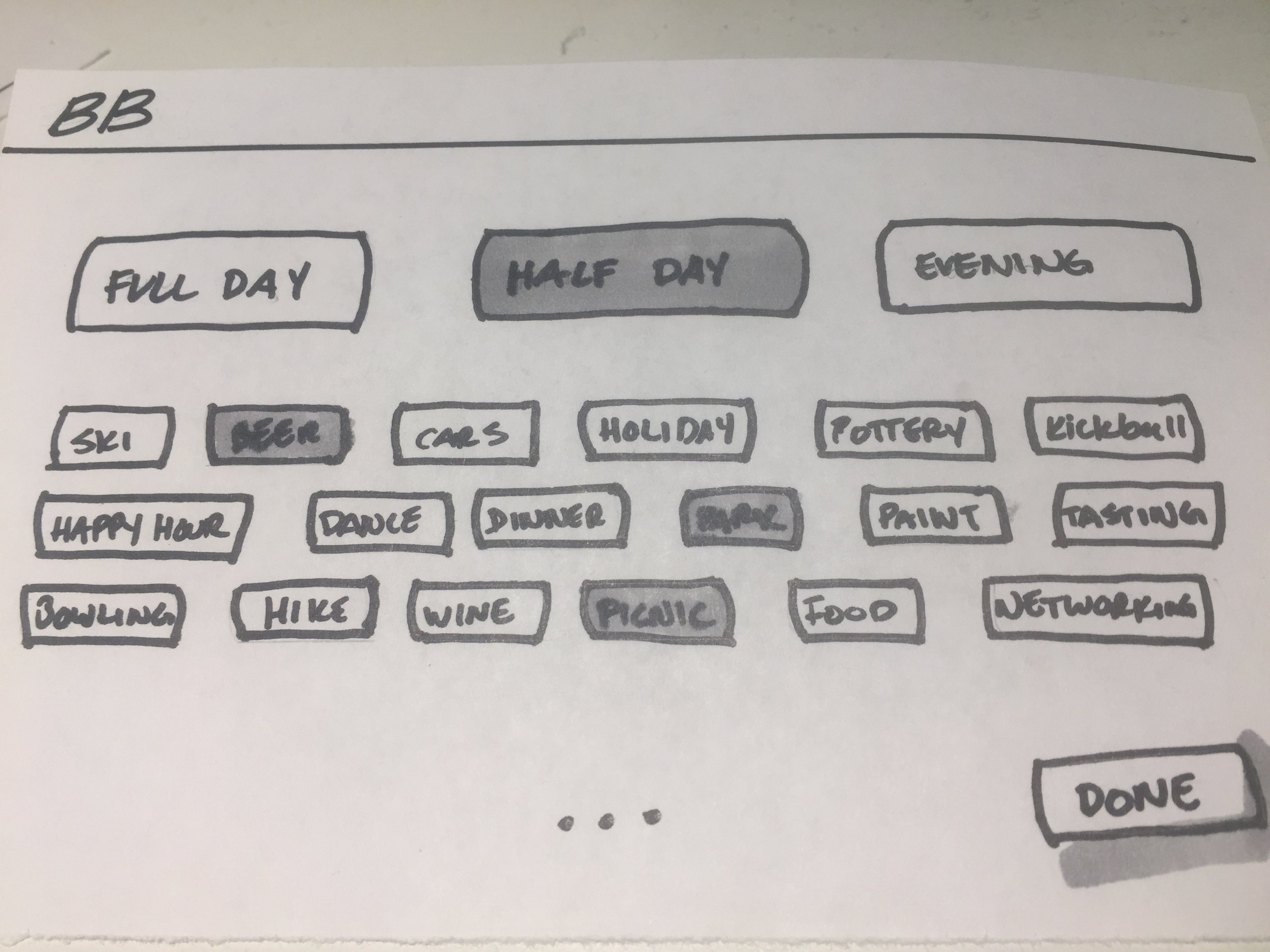
Based on these interviews we decided on a few things that will improve their experience:
- Emphasize browsing first with images and filters, instead of pushing users directly to the builder.
- Consider full transparency by showcasing important details like pricing and what's included.
- Allow users to save, edit and share multiple agenda options.


Mid-fi Validation
One huge takeaway from our first round of testing was that we'd need at least one more round than we initially scoped out. That's cool, we adapt and conquer. In the end, it is much easier for me to have taken the time to develop a second version of the wireframe prototype before spending time on visuals.
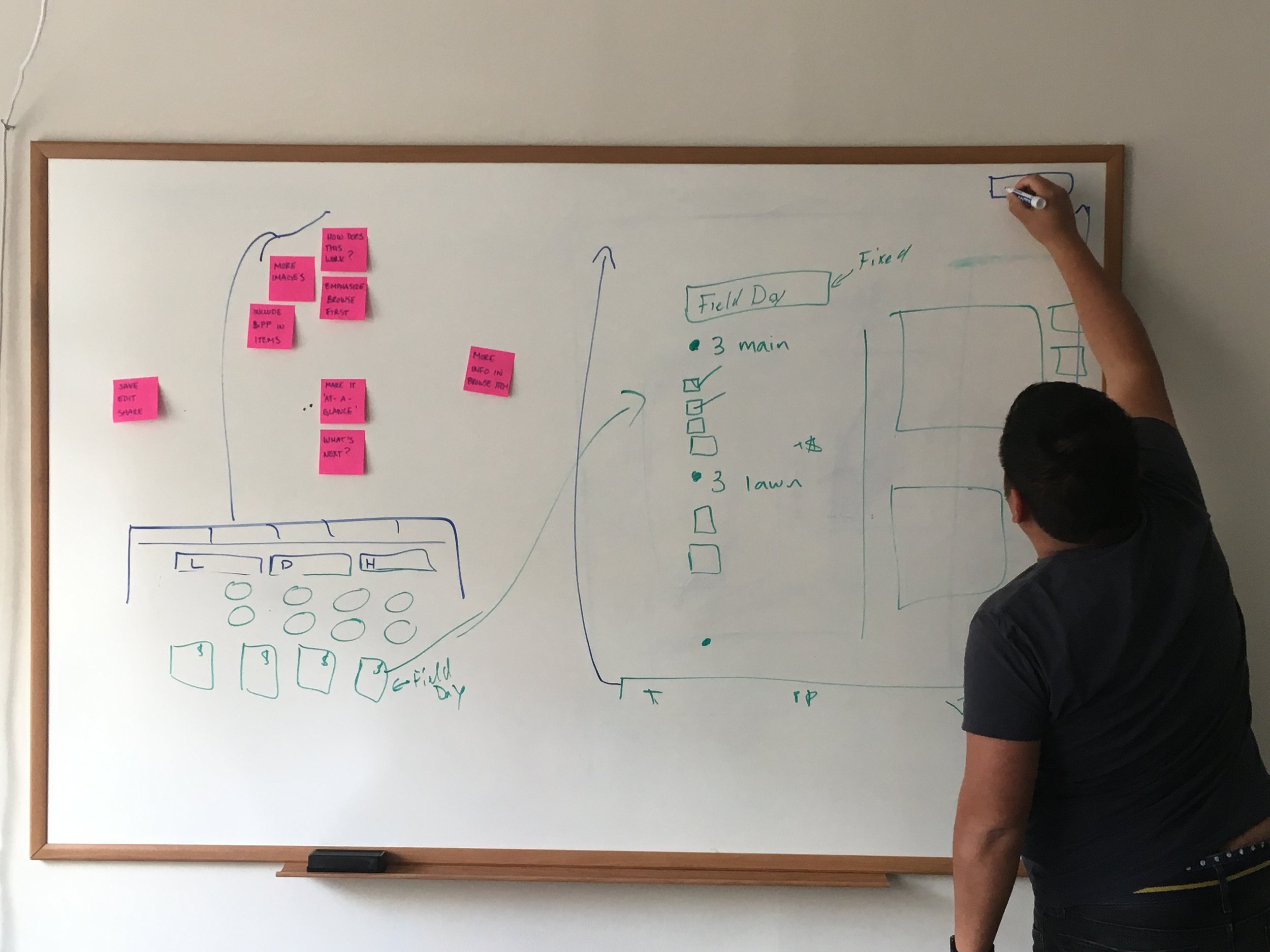
Ideation
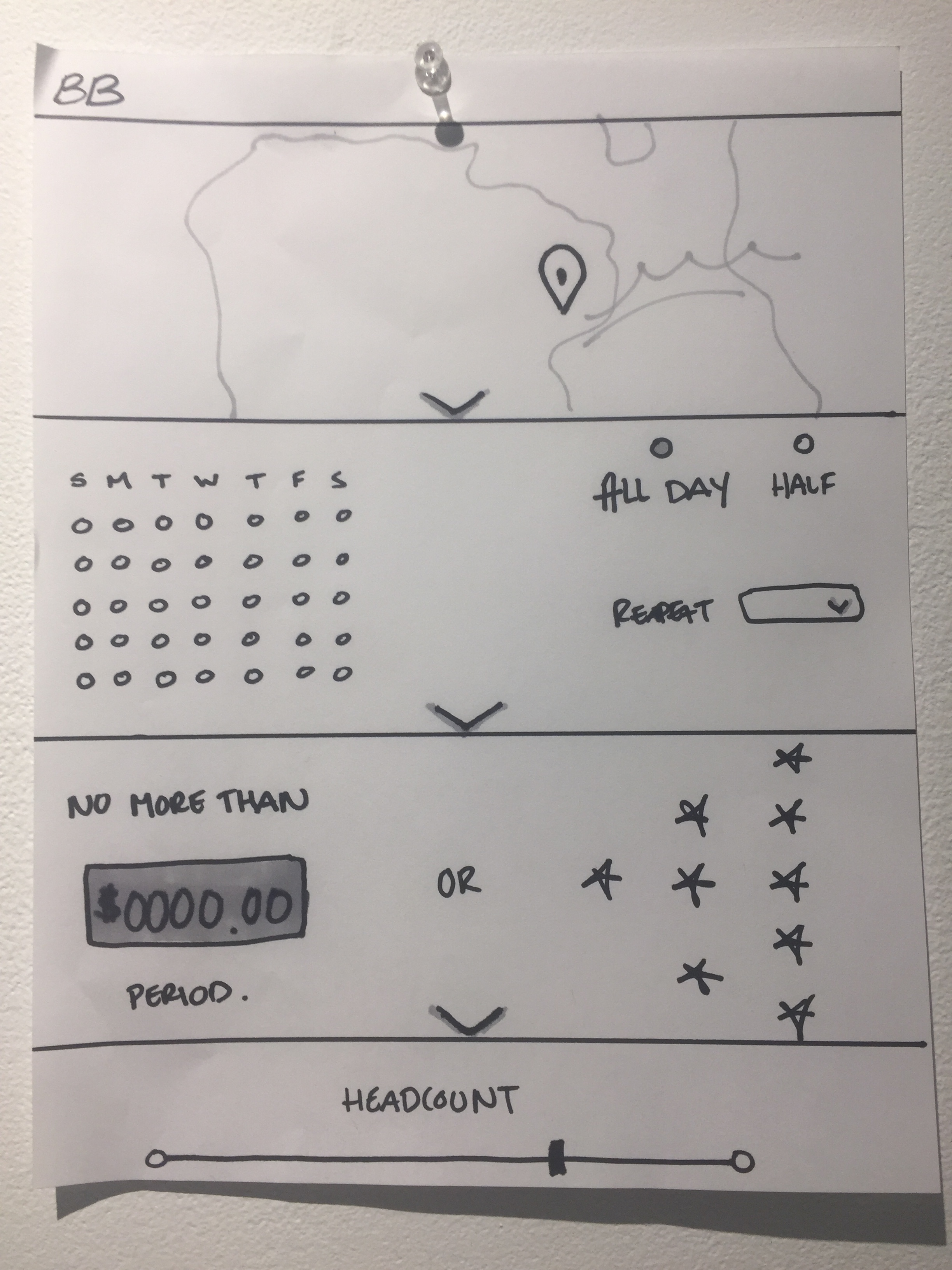
To build the next prototype I returned to the whiteboard with the uncovered pain points in mind. Goals for this phase:
- Provide grounding: let users know what happens next.
- Provide transparency: show all relevant package details.
- Provide ownership: allow users to save, edit, compare and share multiple agendas.


Usability Testing
After sketching out suggestions and presenting to my client we made design decisions to build the next prototype. We talked to a new group of users, all professionals who plan corporate events, and asked them to perform the same tasks as the previous group.
Soundbites
What is normal?
I like that you show me what I wouldn't think of but need.
Tell me how this works upfront.
Goals
We concurred on the following items to keep in mind when considering the hi-fi prototype:
- Provide clarity on how it works: why is this useful and what will happen next?
- Consolidate: how can we show everything the user needs in one place?
- Suggestions: indicate suggestions of what is normal by showing our favorite events.

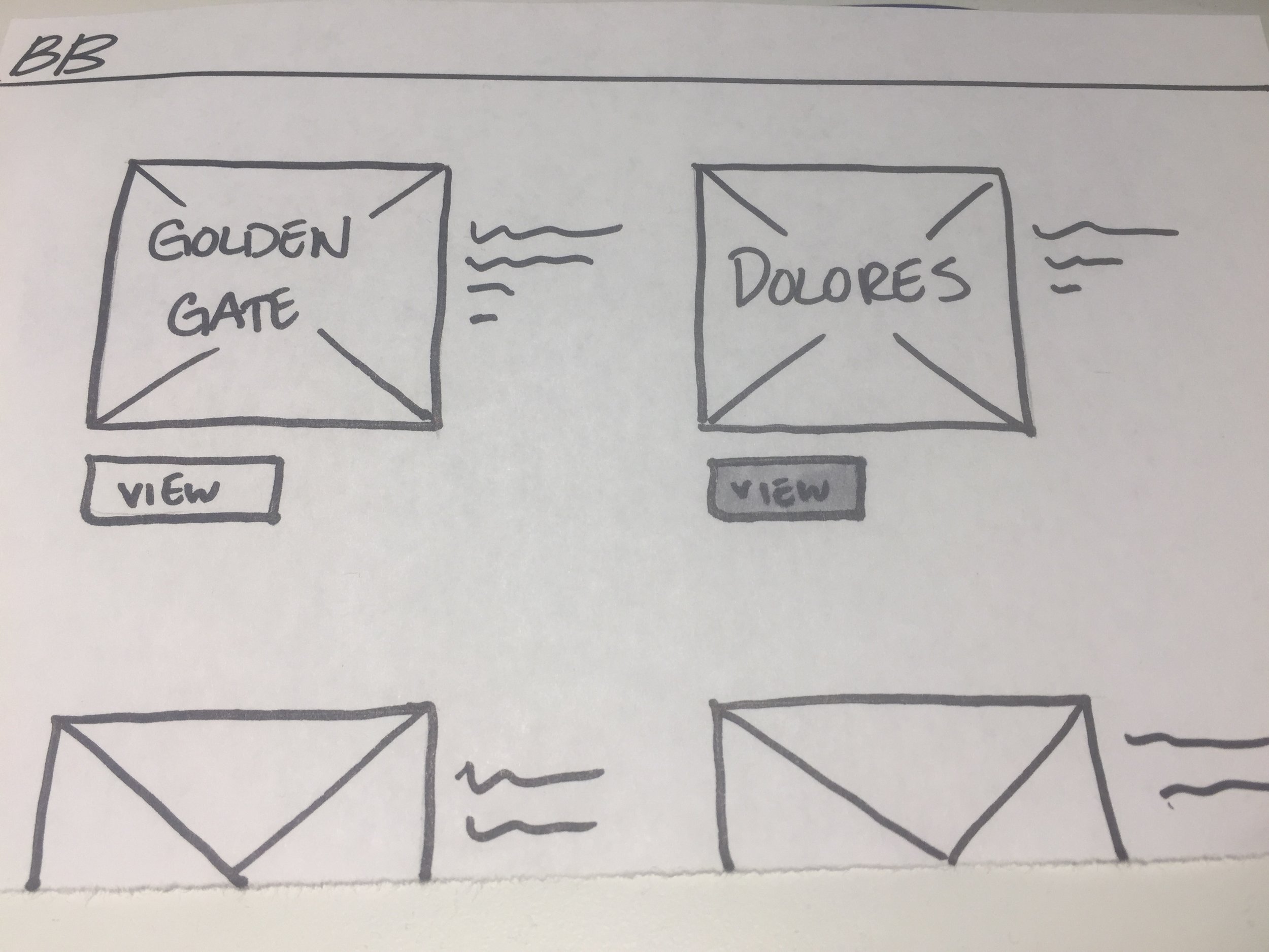
Hi-fi Validation
Finally I can add a splash of color to the sea of blue boxes! Good thing I'd been considering the types of photos I'd like to use for each event the whole time. I used the insights from our last validation phase and started to paint my canvas. We tested this prototype on a new set of six users.
Ideation
The photos were easy and fun, thanks to my friends at Unsplash. Part of the nuance of what Blue Barley offers is that you aren't choosing your vendors but instead your experience. Blue Barley then reaches out to several similar vendors and get's you the best quality on your date. That means that until they can build up a media library of events stock photos are our savior.
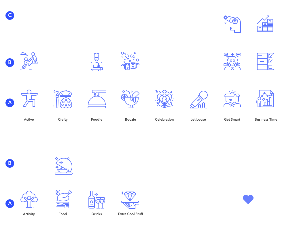
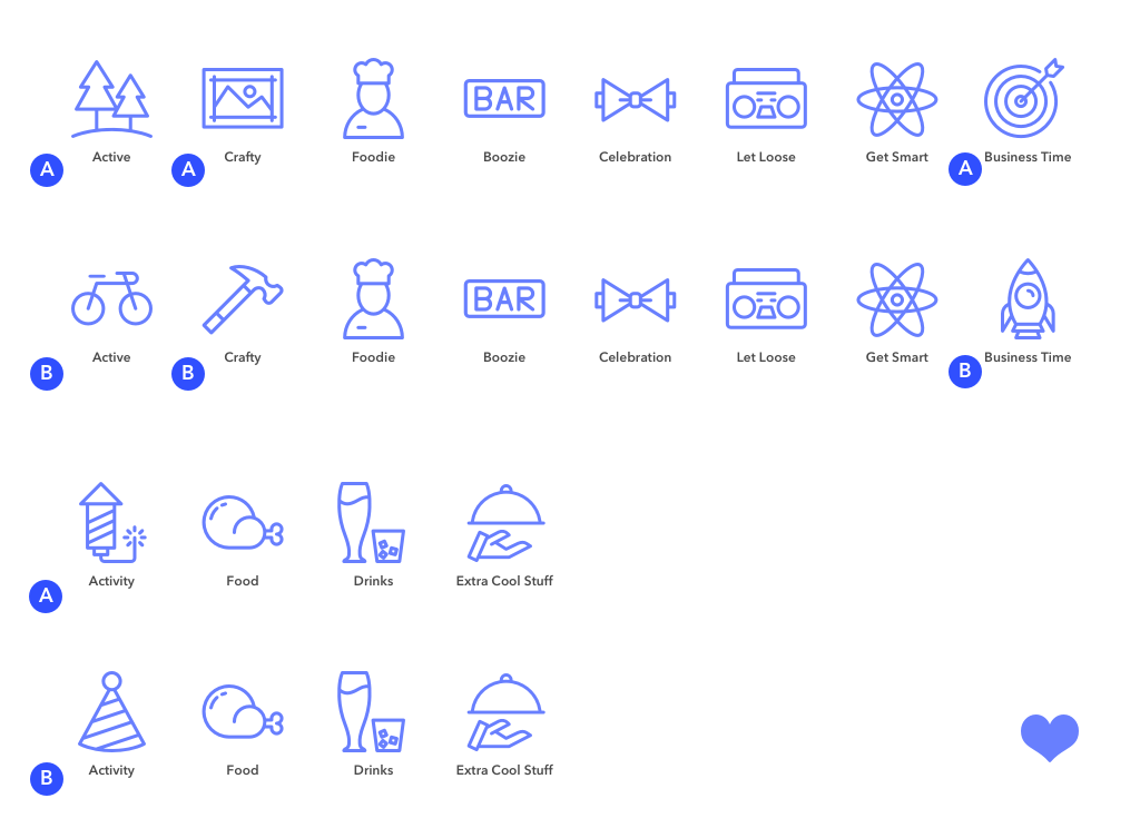
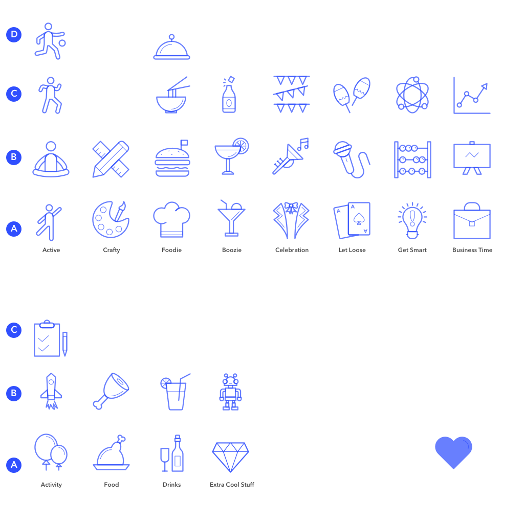
The 'hard part' turned out to be finding the perfect icon set that had enough options to cover the eight different filter categories plus other needs throughout the product. So. Many. Icons. I ended up going with _______ insert here________.
Usability Testing
This is a complex system and I knew there would be many changes to be made still after this round of testing. I did my best to bring the visual design front and center, while leaving certain screens up to the imagination. This helped me hear what users needed and design the rest of the screen with the final design.
Soundbites
I'm not sure what this filter means.
I'd like a wishlist.
Is this all inclusive? How do I book?


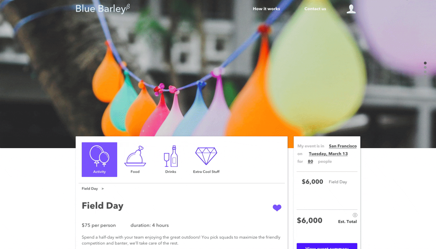
The final product
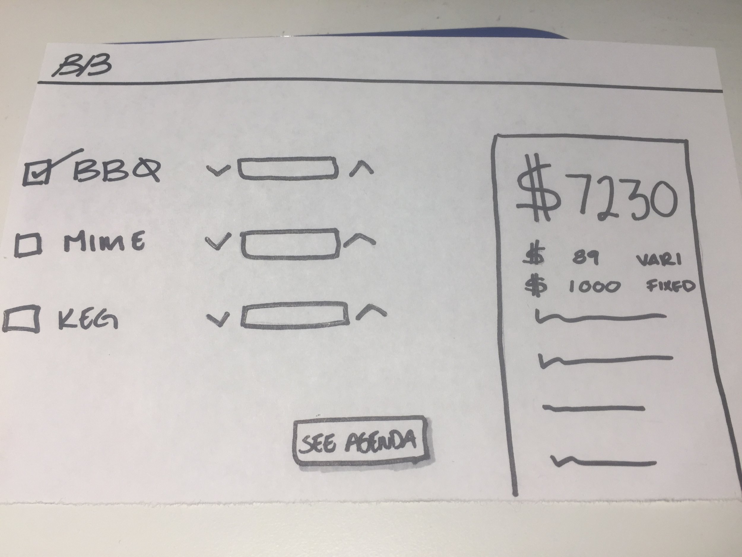
After much deliberation and multiple prototypes we have the last draft. Here are some of the changes we made and why:
- We reduced the number of tone filter categories by combining two and added a "What's Hot" options. With this we:
- reduced overchoice: users were unclear on the differences between "Celebration" and "Let loose"
- provided suggestions: users wanted to know what others liked or what is popular before designing their own event
- We added more preference filters on the landing page
- We added hearts for favorites and stars for ratings, which:
- created a space in "My Events" to save your favorites
- indicates the number and quality of rating an event item has received
- We included different types of preference inputs: the ability to rank, or input free text
- We included small text in the cart describing what the total includes